Expensive Brunette in 2026: Shade Guide for Photos
Expensive brunette in 2026 is all about rich, glossy brown tones with believable dimension that looks even better in photos than in the mirror. This guide breaks down espresso, mushroom, neutral, and warm brunette directions, how to match them to skin tone and lighting, what to ask your colorist, and how to virtual try-on the most photogenic option before you commit.
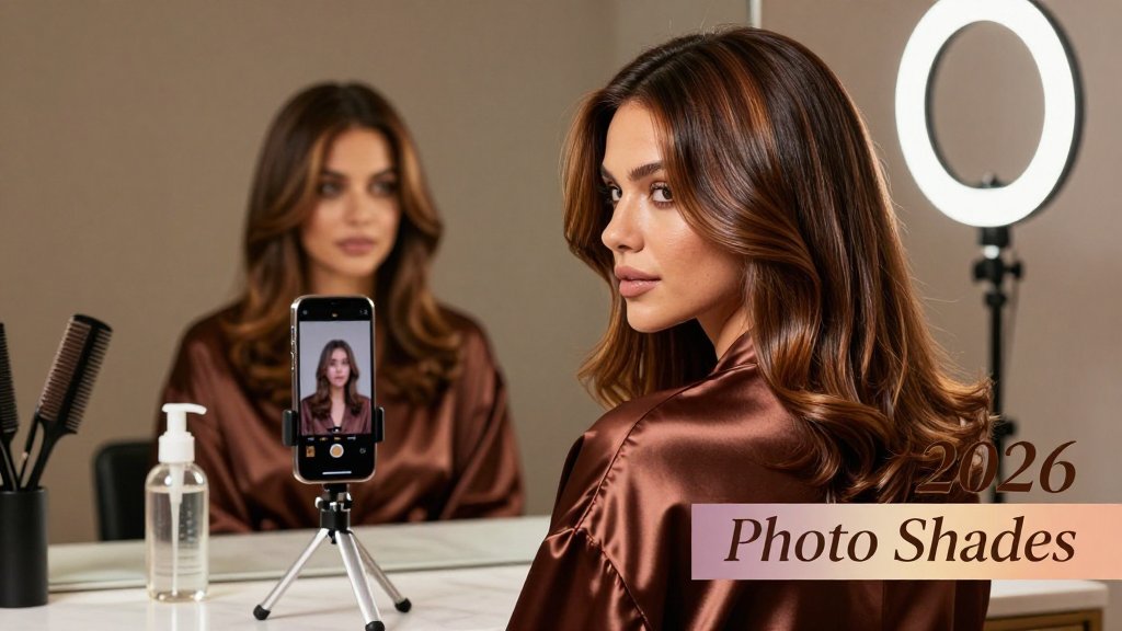
Expensive brunette is trending for a reason, it looks rich in photos, polished in person, and never reads flat. In 2026, the best versions are not one all-over brown, they are glossy, dimensional, and tailored to your undertone and the lighting you live in. This guide breaks down the most flattering shade families, how to avoid brassiness in sun and dullness indoors, and what to ask for, including placement, face-framing, and the right gloss for camera-ready shine.
What expensive brunette means in 2026 photos
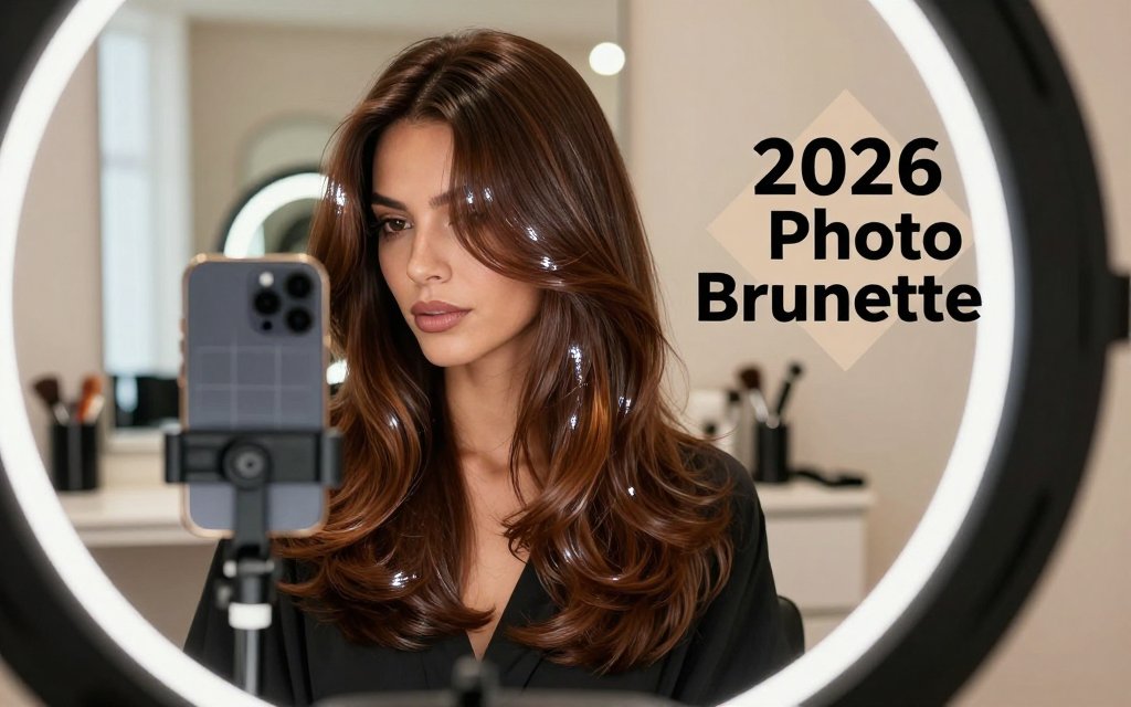
If you have ever loved your brunette in the mirror, then hated it in a selfie, you are not imagining things. In 2026 photos, “expensive brunette” is less about being the darkest, richest brown, and more about how your color behaves under phone HDR, ring lights, wedding flash, and high resolution professional cameras. The goal is hair that reads deep at a glance, dimensional when you tilt your head, and glossy enough that light bounces cleanly instead of looking dusty or brassy. That is why two brunettes can have the same “brown” on a swatch, yet one looks like a luxury blowout and the other looks like flat box dye on camera.
The three photo rules: depth, dimension, reflect
Rule 1 is depth, which means you keep a shadowy base where hair naturally looks darker: the root area, the interior layers, and the nape. For most people, a base around level 4 to 6 photographs as “brunette” without going inky or wig-like. Rule 2 is dimension, which means you add controlled brightness where light naturally hits: the hairline, the top curve of your head, and the ends that sit on your shoulders. A reliable starting point is 1 to 2 levels lighter than your base, done as soft ribbons, not chunky stripes. Rule 3 is reflect, which is the shine strategy that makes the color look rich instead of rough.
Here is why some brunettes look “cheap” on camera, even when the salon work was solid. Flat box-brown is one solid value from root to ends, so your phone boosts contrast and you lose movement, especially in darker selfies. A red cast often shows up as a halo at the hairline and around the part because warmth builds fastest where hair is finer and more exposed to sun and hot tools. Muddy ash happens when you chase “cool brunette” too hard, then the mids turn grayish and matte, which reads like product buildup on a professional camera. The fix is almost always placement plus a gloss plan, not a total shade overhaul.
Reflect is the part people skip, then wonder why their brunette looks dull two weeks later. An “expensive” finish is usually a demi-permanent gloss or toner that evens porosity and adjusts undertone while adding mirror-like shine. If your brunette pulls warm, you do not have to go icy; a neutral-beige or neutral-cool gloss can calm redness without making you look washed out. If your brunette looks too matte or ashy, a clear gloss or a neutral-warm gloss can bring back richness without turning orange. In practical terms, many salons will gloss you every 4 to 8 weeks, and you can stretch it at home with a tinted conditioner (choose neutral or beige-brown, not purple) and a heat protectant to keep shine from cooking off.
Expensive brunette is not a single perfect brown. It is a light map: darker in the shadows, brighter where the sun would hit, and sealed with gloss so your camera sees clean shine, not brass or haze.
Common mistake: choosing a shade in the salon mirror
Salon lighting is a liar because it is rarely one consistent “daylight” tone. Warm bulbs can make a brunette look richer than it will outdoors, while cool LEDs can make the same color look smokier and flatter than real life. Even your phone tries to “correct” what it thinks the light should be. If you want a nerdy anchor for why this happens, photography explains it as Kelvin color temperature, where indoor light is often warmer (more orange) and daylight is cooler (more blue). A quick read on color temperature basics helps you understand why your undertone shifts between the chair and the parking lot.
Use this simple test before you approve your formula. Step into indirect daylight (shade near a window or outside, not direct sun) and take two quick photos: one with the front camera, one with the back camera. The back camera usually shows undertone more honestly, while the front camera can smooth, brighten, or warm you. In the photos, check three things. First, a red glow around the hairline or part means warmth is building and you will want a more neutral gloss, plus better heat protection. Second, a gray haze on the mids means over-ashing or porous hair that is grabbing cool toner, so ask for a softer neutral and more conditioning. Third, if you see one solid block of brown, it is not “too light,” it is missing dimension.
The 2026 mindset shift is this: stop shopping for a color name, start designing how your brunette will photograph from three angles. That is also why your cut and your face shape matter, because layers, movement, and where hair sits on your cheekbones change where highlights should live. If you wear facial hair, the contrast matters even more since a deep brunette can make a beard look heavier or patchier depending on undertone and length. For a quick reference on balancing those proportions, pair your color plan with this haircut plus beard chart, then test your brunette in a few saved photos before you commit. With tools like Fravyn, you can preview brunette depth, face-framing brightness, and gloss-like shine on your own photo so your final result matches your camera, not just the salon mirror.
Shade directions: espresso, mushroom, neutral, warm
If you want “expensive brunette” to look believable in photos, pick a shade direction that holds up in the lighting you actually live in. In 2026, most requests fall into four lanes: espresso (deep and glossy), mushroom (cool-beige), neutral (balanced brown), and warm (chestnut to caramel). A helpful way to describe depth to a colorist is by level, since pros often think in a 1 to 10 system where 1 is the darkest. If you are unsure what “level 4” or “level 6” means, this quick hair level chart makes the terminology easier to picture. Once depth is clear, your undertone choice is what decides whether the color looks rich or oddly “off” in indoor yellow lighting and phone flash.
Espresso brunette hair: the glossy dark option
Espresso brunette is the sleek, glossy dark brown that can read almost-black in low light, but still reflects light on bends and waves. In warm indoor lighting (restaurants, kitchens, reception halls), espresso can look extra inky and dramatic, which is gorgeous with crisp outfits like a white button-down, a black blazer, or a clean minimalist wedding look. In daylight, a true espresso shows soft brown dimension rather than a flat “sharpie” effect. It often flatters deeper skin tones, high-contrast coloring (dark brows and eyes), and anyone who wants their haircut shape to look ultra-defined, like a blunt collarbone lob or long layers with a glassy blowout.
The photo trap with espresso is going too cool. A blue-black base can turn harsh against warm or olive skin, and it can also look like a wig in flash photos because the camera “clips” the highlights. The easiest salon description is: “Level 2 to 3 brunette, espresso depth, with a soft neutral reflect, not blue-black.” Then add one detail that prevents the helmet effect: ask for micro-dimension near the face. That can be very fine baby lights, a subtle face frame, or a few ribbon lights placed around the hairline and part, followed by a sheer gloss to melt everything together. You get contrast and shine without obvious stripes.
Mushroom brunette 2026: cool-beige, not gray
Mushroom brunette in 2026 is not a flat ashy brown and it is definitely not gray. Think cool-beige brunette with taupe dimension, like a latte with an extra splash of cream instead of a silver filter. In indoor warm lighting, mushroom reads smoother and more expensive than a golden brown because it resists that orange cast that can pop under yellow bulbs. In daylight, it looks airy and softly sculpted, especially with lived-in techniques like balayage, a root melt, and fine lowlights to add depth. This direction is popular for low-maintenance brunettes because the grow-out line is less obvious and it helps hide brass between gloss appointments.
The camera risk with mushroom is dullness if you skip shine. Taupe dimension needs a reflective gloss, otherwise photos can make it look dusty, especially on textured hair where light hits more irregularly. Give your colorist a guardrail that matches your undertone: if your skin reads peachy or golden, keep mushroom more beige than slate (ask for “cool-beige” instead of “ash”). If your skin reads pink or neutral, you can go slightly cooler and more smoky. A practical salon line is: “Level 5 to 7 mushroom brunette, taupe-beige dimension, plus a clear or beige gloss for shine.” That one sentence prevents both brass and grayness.
Neutral and warm expensive brunette: the safest camera colors
Neutral expensive brunette is the “my hair but richer” choice, and it is the most forgiving across mixed lighting. Neutral does not lean obviously cool or golden, so it stays believable in an office with fluorescent lighting, in the car on a sunny day, and in flash photography. In photos, neutral brunette tends to show soft depth at the roots and gentle lightness on the ends, which makes hair look thicker and healthier. It flatters people who wear both warm and cool makeup, anyone with medium contrast features, and brides who want hair to look timeless next to ivory fabric. Ask your colorist for a neutral base with a sheer gloss, then choose either a subtle face frame or a few low-contrast ribbons for movement.
Warm expensive brunette is where you see chestnut, cinnamon, cola, and caramel “toffee ribbon” highlights. In indoor warm lighting, it looks plush and luminous, especially on curls and waves because the warmth catches each bend. In strong daylight, warm brunette can shift brassy faster if the tone is too orange, so the key is controlled warmth, think chestnut and soft copper rather than pure gold. This direction often flatters golden, olive, and deeper skin tones, and it makes eye colors like hazel, amber, and deep brown look brighter on camera. Tell your colorist: “Warm brunette, chestnut tone, no orange, keep the dimension low contrast.” The best choice is the one that stays rich in your everyday lighting, not just in the salon mirror.
How to pick the most photogenic brunette shade
A brunette looks “expensive” in photos when three choices line up on purpose: undertone, depth, and dimension placement. Start with undertone (cool, neutral, warm) because it controls whether your skin looks clear or slightly sallow on camera. Next pick depth based on your natural contrast level (your brows, eyes, and skin together). High contrast features usually photograph best with deeper levels like espresso or deep chocolate, while low to medium contrast often looks fresher with a softer level 6 or 7 brown. Finish with dimension placement that matches your haircut and face shape, so the light hits where you want it: cheekbones, eyes, and jawline, not random stripes.
What to ask your colorist for dimensional brunette color
Skip vague requests like “make it rich” and walk in with numbers and placement. Try: “I want a neutral to slightly warm brunette base (not ashy), around a level 4 to 6 depending on what you think flatters my contrast. Then add fine ribbons 1 to 2 levels lighter, focused around my face and on the crown, so it photographs brighter without looking highlighted.” If you wear curtain bangs or a layered lob, ask for the lighter pieces to start at cheekbone level, not at the root, so your bangs do not turn chunky. If you have curls or coils, request micro-ribbons that follow your curl pattern, so the dimension reads as glow, not stripes.
For the finish, ask for shine on purpose: “Please gloss me in the level 5 to 7 range to boost reflect and soften any brass without going gray.” That gloss step is where brunette turns from flat to camera-ready, especially in flash photos. For lower maintenance, add: “Let’s do a soft root shadow so regrowth blends, plus lived-in balayage placement so the brightness stays on the mid-lengths and ends.” Most people can refresh a gloss every 4 to 8 weeks, with the shorter end if you heat style often (blowouts, flat ironing, curling) and the longer end if you air-dry and use heat protectant consistently. Bring two photos you love, one indoors and one in daylight, so your colorist can match the lighting reality you actually live in.
Dimension placement should also flatter your face shape, not just the trend. Round faces usually love brightness slightly below the cheekbone to elongate, while square jaws often look softer with a subtle face frame that starts around the corner of the jaw and melts down. Heart shapes tend to photograph beautifully with brightness near the temples and through the ends to balance a narrower chin. If you are planning wedding photos, ask where the lightest pieces will sit when your hair is styled, because an updo can hide your crown ribbons, and a half-up style can spotlight them. A quick sanity check is to see your hair pulled back and forward in the mirror, then place the “money piece” where it brightens your eyes first.
Salon script to screenshot: “Neutral to slightly warm brunette base, fine ribbons 1 to 2 levels lighter around my face and crown, root shadow for grow-out, and a level 5 to 7 gloss for shine. Keep it blended, not stripy.”
What is expensive brunette, and how is it different from regular brown hair?
Expensive brunette is not a single shade, it is a finish and a formula strategy. Rule of thumb: it should look glossy, softly dimensional, and intentionally toned, like your hair always lands in good lighting. Regular brown hair often looks one-note, especially in photos, because it is either a single-process color with no contouring, or it is highlighted without a blending plan. The biggest mistake to avoid is going too flat or too ashy “to be safe,” which can drain warmth from the face and make hair look dull instead of luxe.
Which brunette shade is best for my skin tone and typical lighting?
Match temperature first, then depth. Rule of thumb: if you look healthiest in gold jewelry or warm makeup, choose neutral-warm browns like chestnut, cocoa, or caramel ribbons. If silver jewelry and cool pink makeup make you pop, try neutral-cool browns like mushroom brunette or a cooler mocha gloss. For depth, use your contrast: darker brows and eyes can carry level 3 to 4 espresso, while softer features often photograph best with level 5 to 7. If you want a quick reference for the numbering, many pros follow a hair color level chart. Common mistake: choosing a super-ashy brunette for office fluorescents, then hating how gray it looks in daylight.
How do I use a virtual hair color try on to choose the most photogenic brown?
Treat virtual try-on like a lighting test, not a single selfie decision. Rule of thumb: if a brunette shade still flatters you in three lighting setups (window daylight, warm indoor ламps, and camera flash), it is likely to photograph well in real life. In Fravyn on iOS, upload a clear front-facing photo, then test a few depth families (espresso, neutral chocolate, soft level 6 to 7 brown) across at least two angles. Use the face shape analysis to sanity-check placement ideas, like whether brighter face framing will widen or elongate your look. Common mistake: trying colors on a heavily filtered photo, or only in one bright bathroom light, then being shocked when the shade reads too dark outdoors or too warm under restaurant lighting.
Ready to see how a new hairstyle looks on you? Try Fravyn and preview 50+ styles on your own photo in seconds, so you can pair your expensive brunette shade with a cut and styling that truly fits your face. Download now and start experimenting before your next appointment or wedding trial. Get it here: iOS.
Try a New Hairstyle Today
Preview 50+ hairstyles and 29+ colors on your own photo with Fravyn.